250ml PP Makeup Remover Cotton Pads Jar
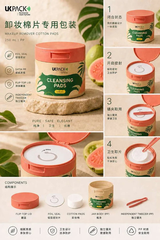
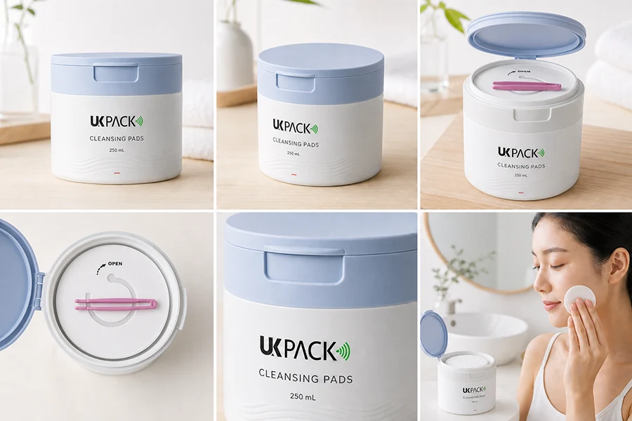
This 250ml PP makeup remover cotton pads jar features a flip-top lid, foil seal, and independent tweezer, ensuring both convenient access and a hygienic user experience. It is available in six distinct design styles, offering the flexibility to meet diverse beauty market demands and brand positioning demand.
| Capacity | 250ml |
|---|---|
| Body Material | PP |
| Gasket Material | PE |
| Tweezer Material | PC |
| Flip-top Material | PP |
Six Design Options for Different Markets
The 250ml PP makeup remover cotton pads jar is available in six market-oriented design options, each developed with a distinct color palette, visual language, and lifestyle aesthetic. While the functional structure remains consistent, the exterior design can be adapted to different regional beauty preferences and brand positioning.
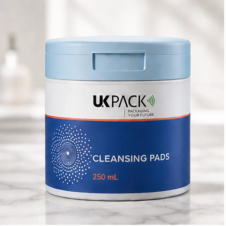
01. North America: Clinical Efficacy Blue
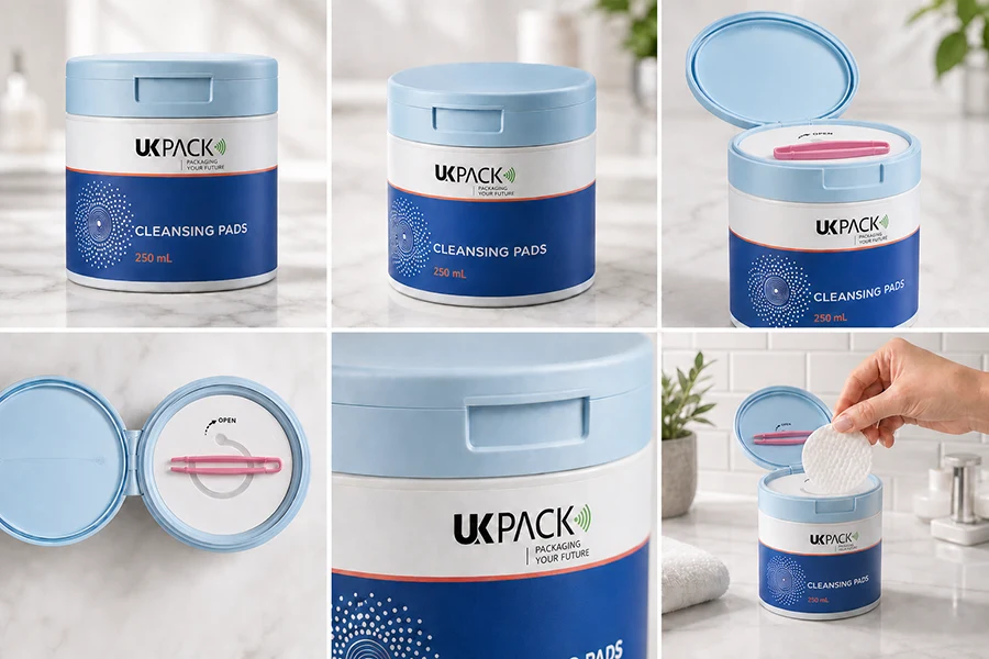
The North American design uses a cool blue and white color palette to create a clean, clinical-inspired appearance. The deep blue lower section adds visual depth and reinforces a sense of efficacy, while the fine graphic details provide a subtle connection to professional skincare. This direction is designed for brands that want to communicate cleanliness, reliability, and performance in a modern beauty packaging format.
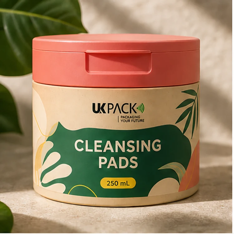
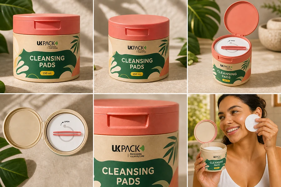
02. South America: Warm-Toned Botanical Green
The South American design combines warm beige, botanical green, and coral tones with tropical foliage and fruit-inspired graphics. The natural green elements create a strong connection with botanical freshness, while the warm coral lid adds energy and visual warmth. Together, these elements create a lively and approachable beauty aesthetic inspired by nature, freshness, and an active everyday lifestyle.
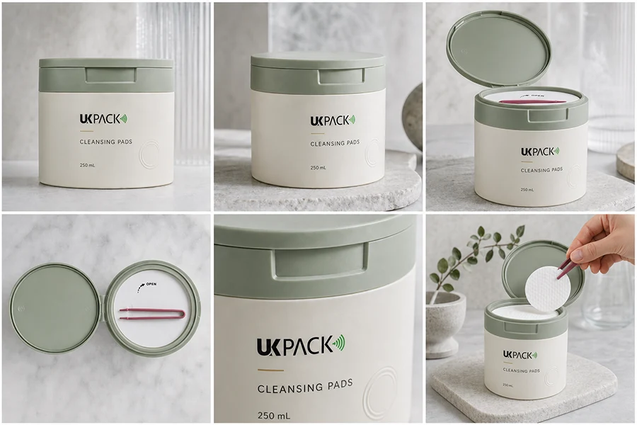
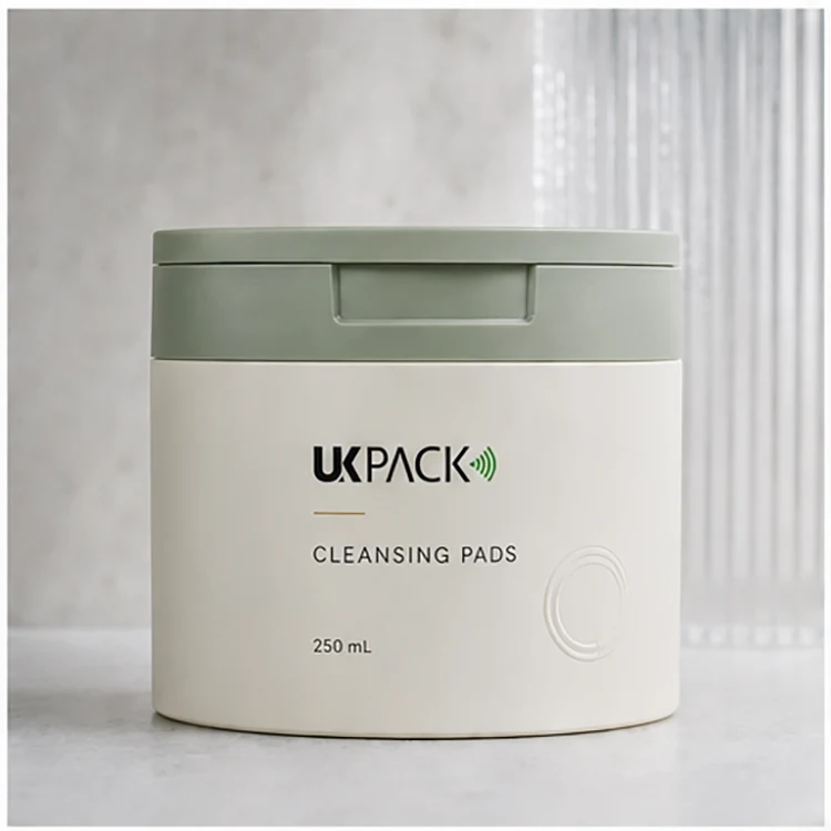
03. Europe: Quiet Luxury Dermocosmetic Grey-Green
The European design adopts a muted sage green and soft neutral palette to create a restrained and sophisticated appearance. The minimal typography and understated graphics give the packaging an apothecary-inspired character, while the low-saturation colors communicate calmness and refinement. This direction is suitable for beauty brands seeking a premium, natural, and understated visual identity.
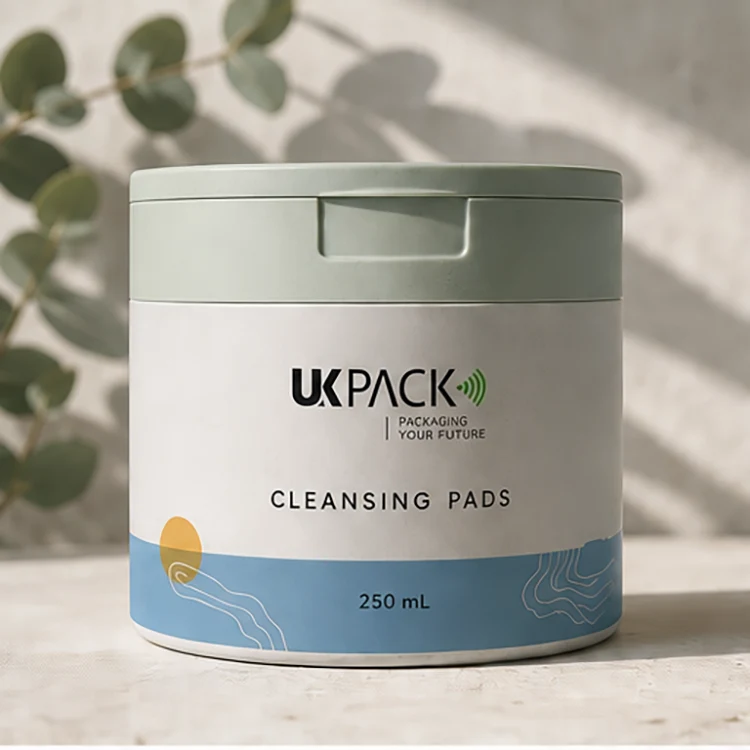
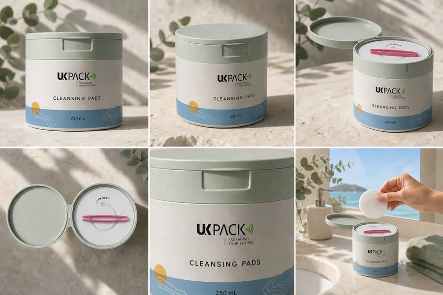
04. Australia: Mineral Coastal Blue & Green
Inspired by Australia’s coastal and mineral landscapes, this design combines soft sage green, natural white, and muted blue with subtle botanical and mineral-inspired graphic elements. The relaxed color palette creates a fresh and open visual impression, while the natural textures connect the packaging with Australia’s outdoor and coastal lifestyle. The result is a clean yet organic direction with a distinctly contemporary feel.
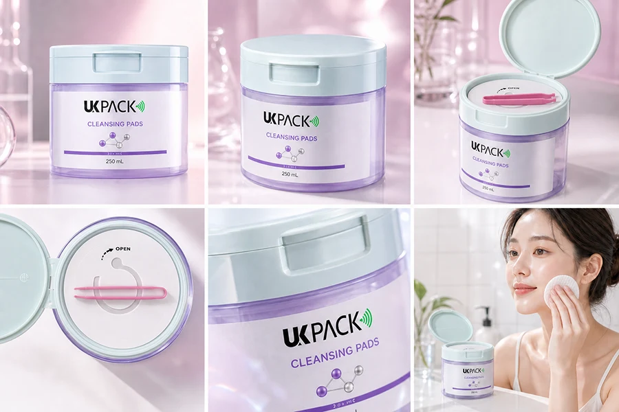
05. Korea: Icy Translucent Purple Mint
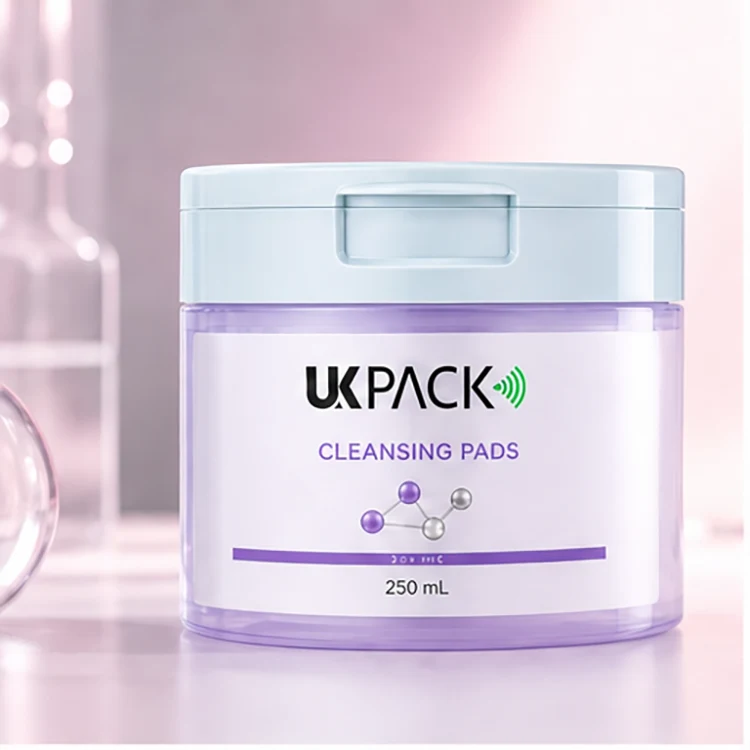
The Korean design combines icy lavender, soft mint, and translucent cool tones to create a fresh and contemporary beauty aesthetic. The pastel palette gives the packaging a light and youthful appearance, while the subtle transparency and soft visual effects add a modern skincare feel. This direction reflects the clean, delicate, and trend-conscious visual language commonly associated with contemporary Korean beauty packaging.
06. Japan: Apothecary White & Light Blue
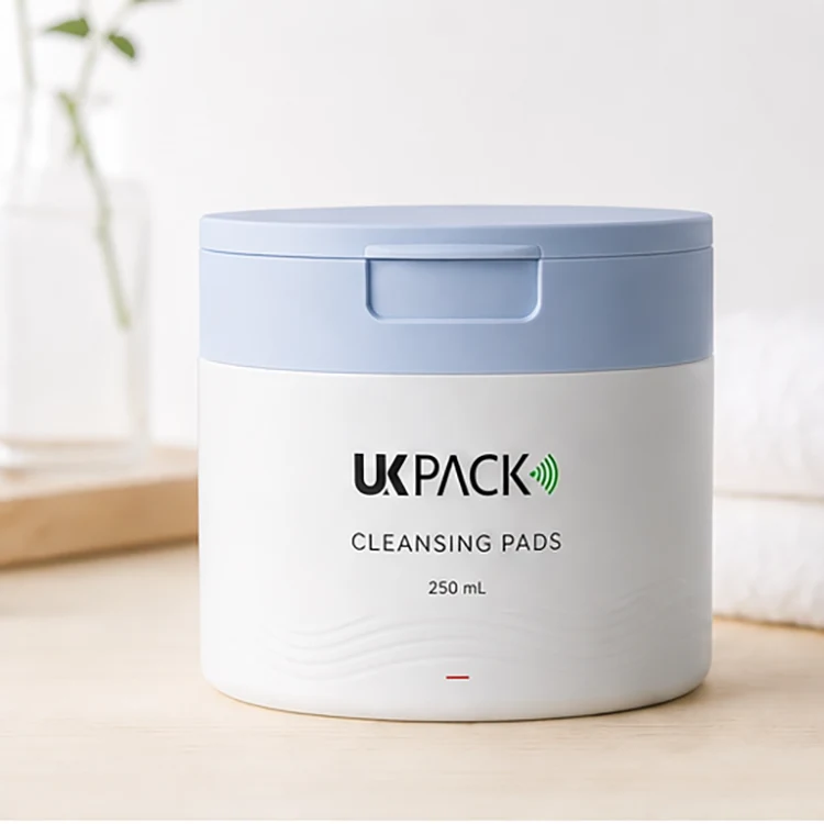
The Japanese design uses a predominantly white and light blue palette to create a clean, gentle, and highly refined appearance. The minimal graphics and spacious layout emphasize clarity and simplicity, while the soft blue accents add a subtle sense of freshness. This direction focuses on understated functionality and a calm skincare aesthetic, making the packaging feel clean, trustworthy, and easy to understand.
Flexible Packaging for Global Beauty Brands
Beyond its everyday cotton pad storage function, the jar also provides a versatile canvas for beauty packaging design. The simple cylindrical form works well with different colors, graphics, finishes, and branding treatments, allowing the same packaging format to take on distinct visual identities across product lines and markets.
For brands developing multiple beauty products, the jar can be paired with complementary formats such as cosmetic jars to create a more cohesive packaging family. Shared visual elements can connect different product categories, while individual designs still allow each product to communicate its own function and positioning.
With six available design directions and a consistent PP structure, this cotton pads jar can support both individual product launches and broader beauty packaging programs. It gives brands room to build a recognizable visual system without requiring every product to look exactly the same.