Cosmetic Packaging Design Trends 2026: 8 Directions Beauty Brands Should Watch

Founder of UKPACK, chief packaging engineer and designer with 18 years of experience, and Red Dot Award winner. I work on cosmetic packaging structure, material selection, mold feasibility, decoration processes, and leak-risk control, helping brands turn packaging ideas into reliable production-ready solutions. See my senior packaging engineer qualification.
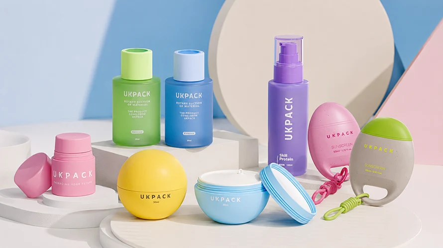
Most cosmetic packaging design trends 2026 lists count individual looks; the more useful way to read them is to watch where they converge. Across skincare, color cosmetics, and personal care, design is moving in three directions at once: less but more deliberate, designed for reuse and defensible claims, and function becoming the design. Quiet minimalism, tactile finishes, refill systems, and mono-material structures all sit inside one of those three shifts.
This guide breaks 2026 into eight trends, but it reads each one the way a packaging engineer does: what the look actually is, which formats it suits — bottle, jar, tube, airless, pump, applicator, stick, or tottle — and where it tends to fail between the render and the filled, shipped, shelf-ready pack. At the end there is a short framework for deciding which direction fits your formula and launch plan, so the trend you choose survives production and not just the moodboard.
The Three Shifts Behind 2026 Cosmetic Packaging Design
Before the individual trends, it helps to name the forces underneath them. Most 2026 directions are a response to three pressures: shelves that reward restraint, regulation and shoppers that punish vague sustainability, and formulas that increasingly want the package to do part of the work.
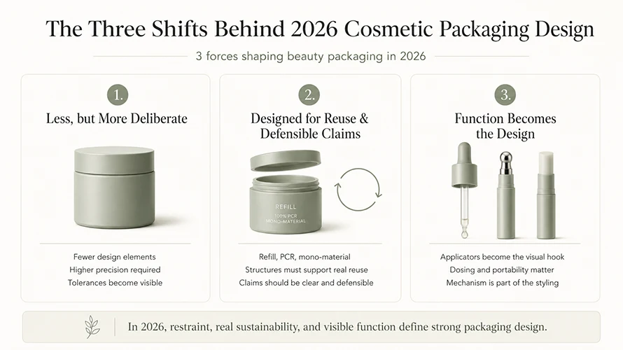
Less, but More Deliberate
Minimalism in 2026 is not empty space; it is fewer elements done more precisely. When a pack drops to one color and one finish, every tolerance shows. Gate marks, parting lines, cap-to-body gaps, and slightly uneven decoration stop being details and become the whole impression. Restraint is harder to manufacture than decoration, not easier.
Designed for Reuse and Defensible Claims
Refill, PCR, and mono-material moves are driven partly by packaging-waste rules in the EU and by closer scrutiny of green claims everywhere. In design terms, that pushes toward structures that can genuinely be separated and refilled, and toward label space that can carry a claim you are able to defend rather than a vague leaf logo.
Function Becomes the Design
Applicators, dosing, and portability are turning into the visual hook. A cooling metal tip, a precise dropper, a flat travel stick, or a satisfying click is both the feature and the styling. The mechanism is no longer hidden under the graphics; it is the reason the product photographs well.
1. Quiet Luxury and Controlled Minimalism
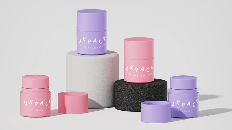
Quiet luxury is the most visible 2026 direction and the easiest to underestimate in production. The look is calm: one dominant color, a single finish, a small embossed or debossed logo, and a heavier-feeling cap. There is nowhere to hide, which is exactly the point and exactly the risk.
This direction suits thick-wall acrylic and PETG jars, frosted droppers, clean cylindrical airless bottles, and heavier fragrance bottles across premium skincare and fragrance. It works less well when a brand wants the minimalist look but keeps a low decoration budget, because the savings a busy label used to hide now show up as visible flaws.
In practice, the parts that decide whether minimalism reads as premium are unglamorous: cap fit and torque feel, parting-line placement, the evenness of a soft-touch or matte coating, and how a debossed logo catches light. A clean white jar with a slightly mismatched cap looks cheaper than a decorated one. My usual advice is to approve a minimalist pack only from a sample under retail lighting, never from a render, because matte and soft-touch surfaces show fingerprints and scuffing that screens never reveal.
2. Tactile, Multi-Sensory Finishes
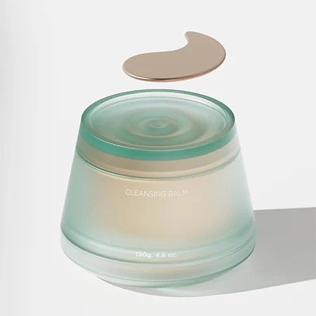
If minimalism removes visual noise, tactile finishes put the interest back through touch. For 2026 this means soft-touch and velvet coatings, true matte, fine ribbing and fluting molded into the wall, contrast pairings such as a matte body with a high-gloss cap, and weight used deliberately to signal value.
Formats that take these finishes well include lotion bottles, cream jars, lipstick and lip-balm tubes, and compacts. The watchouts are specific to each finish:
- Soft-touch and velvet coatings feel premium but scuff and pick up oils; they are risky for sunscreen, shower, and travel products handled with wet or oily hands.
- Deep ribbing and fluting can trap ink and make screen printing or hot stamping register poorly across the texture.
- Weight as a value cue conflicts directly with lightweighting and recycled-content goals, so it has to be a conscious tradeoff, not an accident of wall thickness.
Manufacturer note: tactile finishes are best chosen with the decoration method and the molding geometry together. A ribbed surface, a soft-touch coat, and a hot-stamped logo can each look right alone and still fight each other on the same curved panel.
3. Controlled Color and Light Play
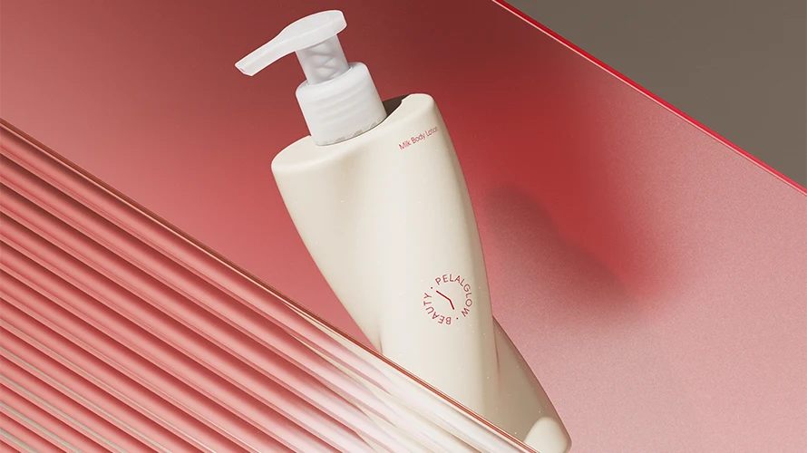
Color in 2026 is becoming more controlled rather than louder. Instead of many decorative colors on one pack, brands are leaning on one dominant resin color, one accent, and one finish contrast. For skincare that often means warm white, soft beige, misty blue, pale green, translucent amber, or a muted metallic accent. For color cosmetics there is more room to play: brighter caps, transparent bodies, shade-visible components, and the gradient and pearlescent effects that catch light on a shelf or a screen. Premium hair care is borrowing the same discipline, with shampoo, conditioner, and treatment bottles unified by one family color rather than a busy label.
Packaging color should also be evaluated as part of the wider shelf presentation. Retail lighting, neighboring products, display materials, and viewing distance can all change how a color or finish is perceived. For beauty brands, custom cosmetic retail displays can extend the same color and visual system beyond the primary packaging, creating a more consistent presentation at the point of sale.
The production reality behind color is where briefs most often slip. A Pantone target that looks exact on a chip behaves differently across PP, PETG, acrylic, and especially PCR resin, which carries its own grey or yellow base and shifts the final shade. Translucent and frosted effects depend on wall thickness and resin, so the same color can read differently on a thin tube and a thick-wall jar. Gradient spraying and pearlescent coatings add cost and an MOQ floor, and they are harder to keep consistent batch to batch than a single flat color.
A short way to keep color decisions honest: match the target on the actual resin and wall thickness you will produce, not on a flat chip, and lock an approved physical limit sample before tooling decoration.
4. Refillable Systems Become a Premium Design Option
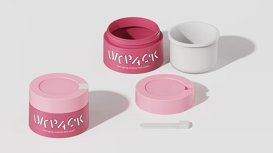
Refillable design has moved from a sustainability talking point to an expected option in premium skincare and makeup, and the 2026 versions are better engineered than the first wave. The recognizable looks are a screw-in or drop-in inner cup for a cream jar, a twist-to-replace airless cartridge, and a heavier outer shell — often aluminum or thick acrylic — that is meant to be kept.
The design only works if the refill mechanism is obvious without a manual. In my experience, the most common failure is not the container; it is user behavior. If the refill is fiddly, leaks at the join, or makes the outer shell look worn after two cycles, the system gets abandoned and the extra components were wasted. For air-sensitive actives, a refillable airless format usually beats a refillable open jar because it keeps the cleaner-dispensing benefit through each refill. For one documented project, UKPACK built a custom 50 ml refillable airless pump jar for Clae, which is the kind of format that gives jar-style access while protecting the formula.
If you are weighing reuse formats against component count and cost, it is worth comparing refillable cosmetic packaging options against your refill behavior and target market before committing to tooling.
5. Mono-Material Structures
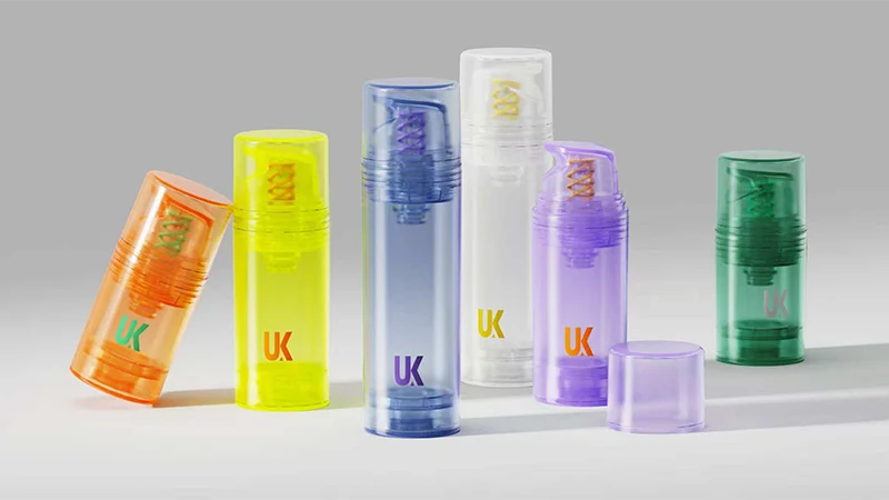
Mono-material design is the quietest trend on this list and arguably the most structural. The goal is a pack where the main body, cap, and ideally the pump or closure are all one plastic family — usually all-PP — so the whole unit can move through one recycling stream instead of being separated by hand. The European Union’s packaging and packaging waste rules are pushing recyclability up the design brief, and mono-material is one of the cleaner answers in design terms: fewer mixed materials, easier separation, and a structure that can actually support a recyclability claim.
Visually, mono-material is mostly invisible, which is the engineering challenge. A metal spring in a pump, a separate gasket, or a different-resin overcap quietly breaks the single-material story, so the work happens inside the component. All-PP airless bottles and mono-material lotion pumps exist precisely to keep dispensing performance while staying in one material family; UKPACK’s documented mono-material lotion pump and bottle for Hemp Worx is one example for body wash and lotion. The honest tradeoff is that mono-material parts can cost more and need careful sampling, and decoration has to stay compatible with recyclability rather than adding a mixed-material layer back on. For brands building around this, mono-material cosmetic packaging is best treated as a structure decision first and a look second.
6. Claim-Aware Sustainable Design
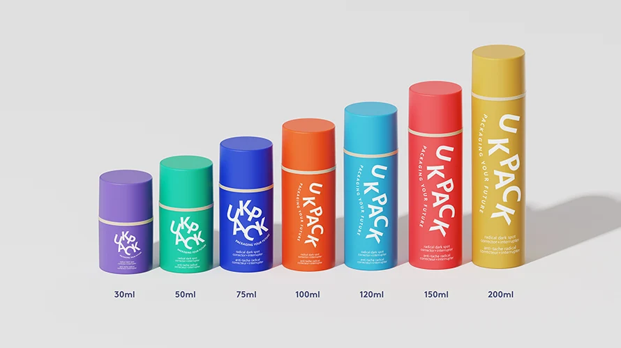
The biggest shift in sustainable packaging for 2026 is tone. After a few years of leaf icons and “eco” language, design is moving toward claims a brand can actually defend, because regulators and shoppers are both less patient with vague green messaging. This is a design problem as much as a legal one.
In practice it changes the artwork brief. Cleaner label space is being reserved for specific, checkable statements — a stated PCR percentage, a clear “refill” instruction, a real recycling note for the target market — instead of broad “100% sustainable” claims. The U.S. FTC Green Guides set the expectation that environmental claims are truthful and substantiated, so the safe design move is to leave room for a precise claim and drop the decorative ones.
It also affects how much can go on the pack. Required information under cosmetic labeling rules still has to fit, so a minimalist front panel cannot crowd out mandatory copy on the back. Where a claim leans on a certificate — recycled content, for example — it should be tied to real documentation; UKPACK’s GRS and carbon-footprint certificates are the kind of backing that lets a recycled-content statement stand up. The design takeaway for 2026: treat sustainability as fewer, stronger, provable claims, and design the label space around them.
7. Skinification and Applicator-Led Packaging
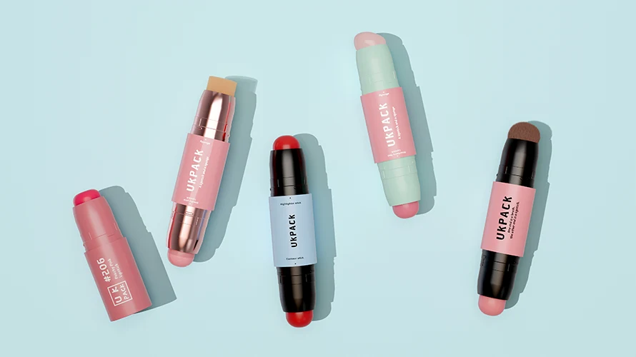
Skinification — color cosmetics borrowing skincare cues, and skincare leaning into ritual — is making the applicator the centerpiece of the design. The look in 2026 is a precise dropper, a cooling metal or zamac tip, a cushion or doe-foot applicator, or a rollerball, presented as the hero rather than hidden under a cap.
This is where function and styling genuinely merge, and it is also where component matching gets strict. An applicator is a system: the tip, the orifice, the wiper, the formula viscosity, and the closure all have to agree. A metal cooling tip on an eye serum feels premium and helps dosing, but it changes the closure design and adds weight and cost; UKPACK’s documented eye-cream bottle for DR.WU paired a 15 ml bottle with a curved metal applicator for exactly that precise-use experience. A doe-foot that is too short or a wiper that is too loose turns a premium gloss into a messy one. The design lesson is that for applicator-led packaging the sample has to be tested with the real formula, because pickup, glide, and clean wipe-off cannot be judged from a drawing.
8. Portable, On-the-Go Formats
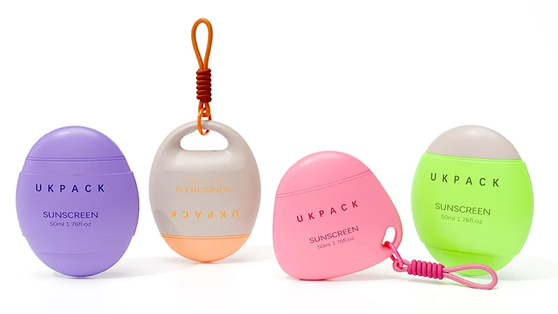
The last 2026 direction is scale. As routines get more mobile and sampling culture grows, smaller and flatter formats are becoming a deliberate design choice rather than an afterthought. Think solid sticks for balms and sunscreen, slim twist-up tubes, mini airless bottles, flat tottles that pack easily, and refill-friendly travel sizes.
Small formats carry their own production constraints, and they are easy to underestimate:
| Portable format | Common use | First production watchout |
|---|---|---|
| Solid stick / twist-up | Balm, deodorant, sunscreen | Fill method and mechanism drag; rub-off on decoration |
| Mini airless bottle | Serum, trial size | Pump priming and consistent low-volume output |
| Flat tottle | Lotion, sunscreen, hand cream | Cap seal and leakage flat in a bag |
| Slim tube | Cleanser, BB cream | Print area on a tight curve |
The recurring theme is that shrinking a pack does not shrink the problems. Decoration area gets tighter, leakage in a handbag is less forgiving than on a shelf, and a small airless or pump has to prime reliably at low volume. Portable is a real design opportunity for 2026, but it is one where a filling and leakage sample matters more, not less.
How to Choose Which 2026 Trend Fits Your Packaging Project
The trends above are directions, not a menu to pick from by looks alone. The fastest way to narrow them is to run a project through four filters before you brief decoration or cut a mold.
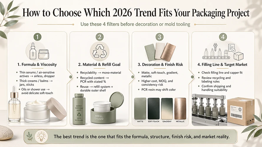
Formula and Viscosity
Start with what is going in the pack. Air-sensitive actives and thin serums point toward airless and dropper formats, which favor the refillable-airless and applicator-led directions. Thick creams and balms suit jars and sticks. A formula with oils or a shower-and-travel use case rules out delicate soft-touch coatings before you fall in love with them.
Material and Refill Goal
Decide the sustainability target before the material, because the target changes the structure. A recyclability goal points to mono-material; a recycled-content goal points to PCR and a stated percentage; a reuse goal points to a refill system with a durable outer shell. Each one leads to a different pack, and trying to claim all three at once usually weakens the design.
Decoration and Finish Risk
Match the finish to handling, not just to the moodboard. Matte, soft-touch, gradient, and metallic effects all raise cost, MOQ, or batch-consistency risk, and PCR resin shifts color. The more minimalist the design, the tighter the tolerances have to be, so budget for the finish you actually want rather than discovering the gap at sampling.
Filling Line and Target Market
Finally, check the pack against reality: your filling line and capper, the recycling and labeling expectations of the market you sell into, and how the product will be shipped and handled. A trend that cannot be filled on your line or cannot carry a defensible claim in your market is not the right trend, however good it looks.
Conclusion: Pick a Direction, Then Engineer It
For 2026, the eight trends really resolve into three choices. If your brand lives on shelf presence and ritual, the “less but more deliberate” group — minimalism, tactile finishes, controlled color — will do the most work, provided you can pay for tight tolerances. If your pressure is sustainability and trust, the “reuse and defensible claims” group — refillable systems, mono-material, claim-aware design — is the more durable bet. If your product’s experience lives in how it is applied or carried, let function lead with applicator and portable formats. The mistake is trying to wear all three at once; the strongest 2026 packs commit to one direction and engineer it properly.
Picking the direction is the design decision. Making it survive molding, decoration, filling, shipping, and daily use is the manufacturing one, and the two are easier to solve together than in sequence. If you are scoping a 2026 launch or refresh, gather your formula type, target capacity, preferred format, reference style, sustainability goal, decoration idea, and estimated order quantity, and UKPACK’s cosmetic packaging design services can help pressure-test the look against production before you commit to tooling — the same design-and-engineering work behind our iF Design Award 2026 beauty packaging. Send the project details and reference images, and our team can help narrow the right direction for samples.
Frequently Asked Questions
Q1. What are the biggest cosmetic packaging design trends for 2026?
The dominant directions are quiet luxury and controlled minimalism, tactile and multi-sensory finishes, controlled color, refillable systems, mono-material structures, claim-aware sustainable design, applicator-led “skinification” packaging, and portable on-the-go formats. They converge into three bigger shifts: less but more deliberate, designed for reuse and defensible claims, and function becoming the design.
Q2: What colors and finishes are trending for cosmetic packaging in 2026?
For skincare, expect quieter tones — warm white, soft beige, misty blue, pale green, and translucent amber — usually with one finish contrast such as matte against gloss. Color cosmetics have more room for brighter caps, transparent shade-visible bodies, gradients, and pearlescent effects. Soft-touch, true matte, fine ribbing, and controlled metallic accents are the most-requested finishes, though soft-touch coatings scuff and PCR resin shifts color, so both need a physical limit sample.
Q3: Is refillable cosmetic packaging worth it in 2026?
It is worth it when the outer pack is genuinely kept and the refill is easy and clean to swap, which is most realistic in premium skincare and makeup. It is not automatically greener: a refill system adds components, so it only pays off across several reuse cycles and clear user instructions. For air-sensitive formulas, a refillable airless format usually protects the product better than a refillable open jar.
Q4: How do sustainability rules change cosmetic packaging design in 2026?
They push design toward recyclability and provable claims rather than eco styling. Practically, that means fewer mixed materials and easier separation (mono-material), a clearer recycling and refill message, a stated PCR percentage instead of vague “eco” wording, and label space reserved for claims you can substantiate. Treat it as a design brief — fewer, stronger claims — not a legal afterthought.
Q5: Which 2026 packaging trends appeal most to Gen Z beauty shoppers?
Gen Z preference tends toward refillable and clearly recyclable formats, honest and specific sustainability claims instead of vague “eco” labels, and playful but controlled color such as transparent shade-visible bodies and bright caps. Portable, sampling-friendly sizes and a strong tactile or unboxing feel also matter. The common thread is that the refill or sustainability story has to be real and easy to act on, not just printed on the label.
Q6: What is the most common mistake brands make with packaging design trends?
Approving the look before the production reality. The frequent errors are signing off a minimalist or matte pack from a render instead of a sample, choosing a finish that cannot survive the product’s real handling, and briefing decoration before confirming the color on the actual resin and wall thickness. A trend only counts once it survives filling, shipping, and daily use.