A quick overview of the topics covered in this article.
- 1. Twiggie & Rose
- 2. Skinsmiths
- 3. Henua Organics
- 4. Wildsmith Skin
- 5. Two22
- 6. Luxury Skin Cells
- 7. Herbivore Botanicals
- 8. Glossier
- 9. One Love Organics
- 10. The Woods Eu de Parfum
- 11. The Woods Eu de Parfum
- 12. Tulura
- 13. Peet Rivko
- 14. Salt+Stone
- 15. Alex Carro
- 16. C’est Ça Herbal Soap
- 17. O’Care
- 18. Ahal
- 19. ASARAI
- 20. Dr. Jart+
- 21. The Gentle Label
- 22. Nuda Esta
- 23. Youth to the People
- 24. St. Weiss
- Conclusion
Subscribe to the UKPACK newsletter to receive regular updates on the company, products, services, upcoming exhibitions and more.
In order to establish trust with customers, skincare and cosmetic brands must prioritize the production of high-quality products. Since these products directly come in contact with our skin, there is no room for mistakes.
Just as important as the quality of skincare products is the packaging that accompanies them. As customers initially interact with the packaging, it is crucial that its quality matches that of the products.
Ultimately, if the packaging fails to impress customers, what impression will they have of the product itself?
When considering your own skincare packaging, take into account how you can convey your brand’s story and values. Embrace creativity by exploring various font styles and selecting colors that facilitate easy brand recognition for customers.
To provide you with some inspiration, we have compiled a list of our favorite 24 minimalist skincare packaging designs for skincare brands.
1. Twiggie & Rose
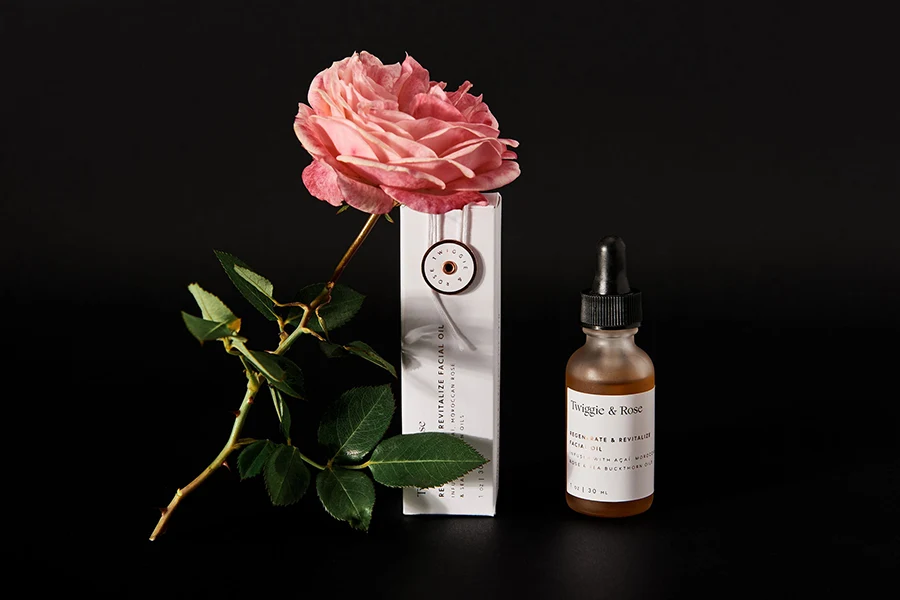
Twiggie & Rose, a skincare brand that focuses on natural, organic, and high-performance products, showcases an exquisite packaging design. The folding carton box is elegantly adorned with vintage colors that harmonize with the brand’s logo and delicate image prints, creating a subtle and feminine aesthetic. Additionally, the attention to detail is evident in the unique feature of a detailed top tuck flap, providing customers with an exclusive unboxing experience. To add a touch of sophistication, the packaging incorporates rose gold foil stamping, further enhancing its overall appeal.
2. Skinsmiths
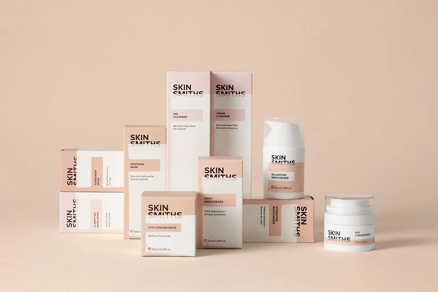
Upon glancing at Skinsmiths’ packaging, it becomes apparent that they prioritize attention to detail. Their folding carton boxes are adorned with colors that symbolize diverse skintones. The brand’s logo stands out in bold, black typography, striking a balance with softer, minimalist text used for product descriptions.
What sets their packaging design apart is the innovative combination of uncoated paper and printed paper, which aptly represents the application of protective skincare products. The skintone colors are printed on an uncoated board, which is subsequently over-printed with a glossy finish, creating a texture reminiscent of applying skin lotion.
3. Henua Organics
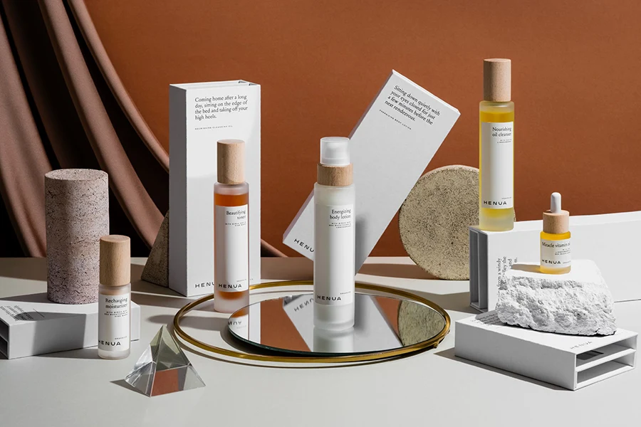
Henua, a luxurious organic skincare brand, is dedicated to crafting harmonious and pure products that bring joy to all. Departing from the conventional folding carton box, Henua has chosen a robust rigid box with a magnetic lid and a custom-cut insert, ensuring the secure placement of its products.
With its minimalist black and white design, Henua makes a striking impression, unmistakably conveying an aura of opulence and excellence.
4. Wildsmith Skin
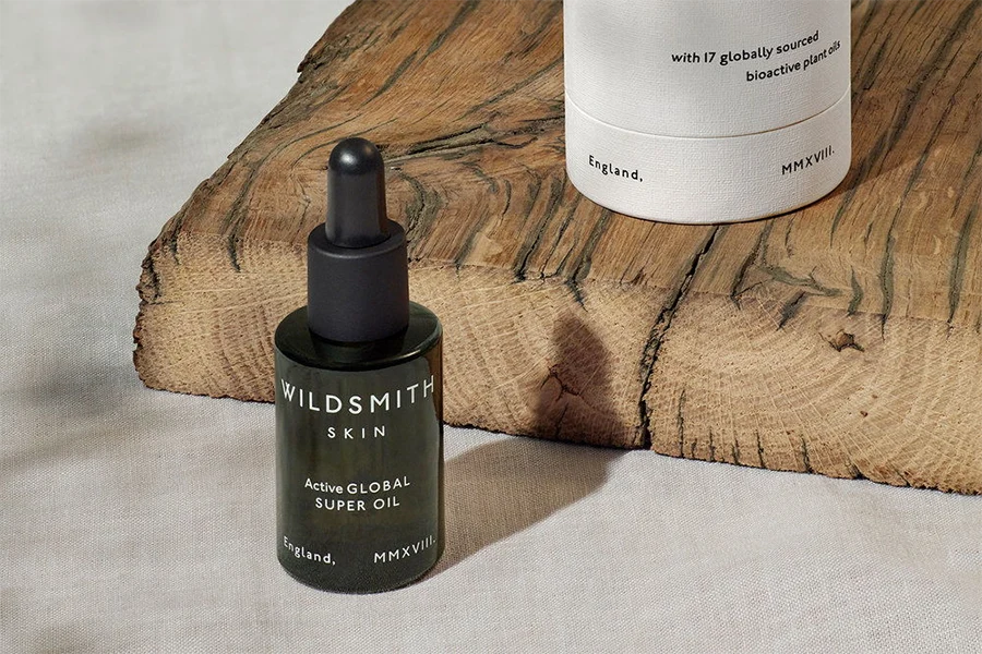
Wildsmith Skin offers eco-friendly skincare products that harness the power of plant-derived bioactives, botanicals, and minerals. Departing from the conventional custom box, Wildsmith Skin has opted for custom printed cardboard tubes to house and safeguard its products. These bespoke tubes are crafted from durable cardboard and feature a natural, textured paper finish, devoid of any coatings. With a minimalist approach, the packaging exclusively utilizes black ink, resulting in a visually captivating design that remains uncluttered and uncomplicated.
5. Two22
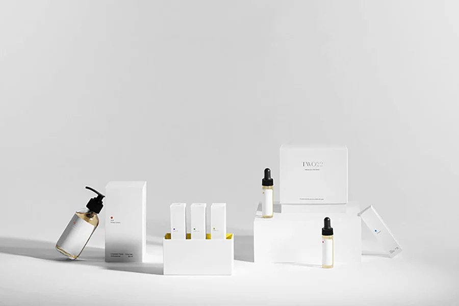
Two22 is a luxury skincare brand that offers customized serums tailored to each customer’s unique skin type and genetic data. When it comes to packaging these serums, Two22 employs folding carton boxes while incorporating understated yet visually appealing elements. Attention to detail is evident, from the meticulously foil-stamped logo to the delicately embossed outline of a serum bottle. Two22 exhibits a keen understanding of packaging design. They have achieved an elegant and minimalist aesthetic with a pristine white exterior, accentuated by a vibrant burst of color on the inside of the box.
6. Luxury Skin Cells
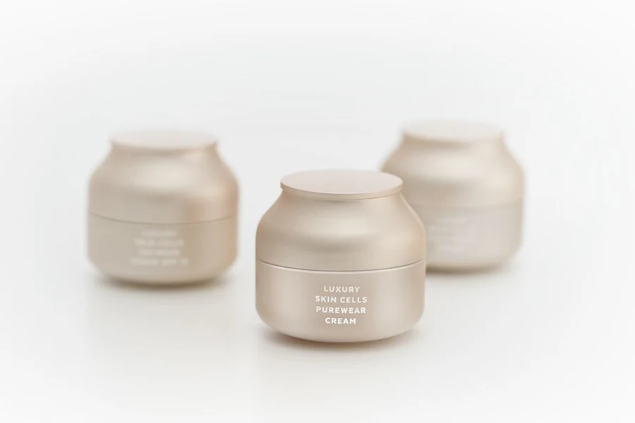
Typically, finishes such as stamping, embossing, glossy coatings, metallic accents, and more are employed to enhance the premium appearance of a product. However, in this case, these finishing techniques are utilized as integral design elements. On one hand, an organic metallic shape reminiscent of cells is incorporated, adapting uniquely to personalize each box for individual products. On the other hand, the text is subtly embossed without ink, allowing the “cells” to become the focal point of the design. The jar’s colors and shapes are thoughtfully crafted to harmonize with the entire range.
7. Herbivore Botanicals
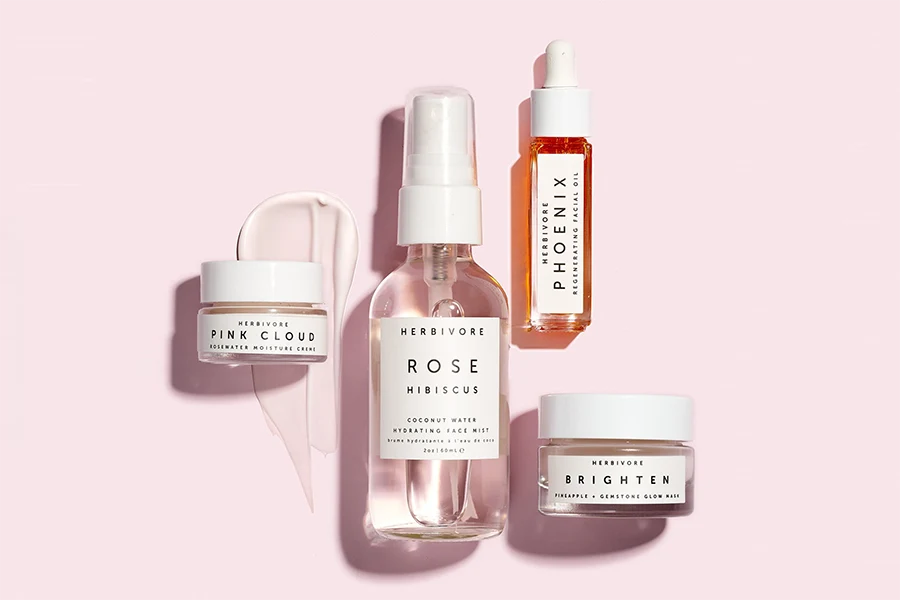
The packaging design of Herbivore Botanicals is characterized by its minimalist aesthetic, allowing the products to take center stage. The use of clean lines, simple typography, and a restrained color palette evokes a sense of purity and authenticity.
To enhance the tactile experience, Herbivore Botanicals selects high-quality materials for its packaging. The choice of glass bottles and jars not only protects the product but also adds a touch of elegance. These containers are often adorned with subtle label designs that reflect the brand’s commitment to simplicity and sustainability.
8. Glossier
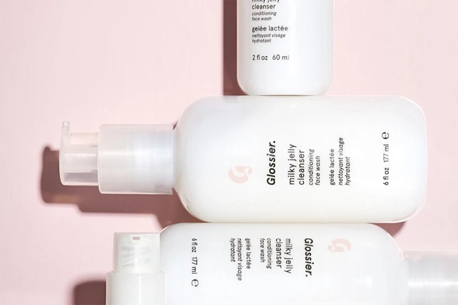
Glossier, known for its fresh and contemporary approach to skincare, extends its unique aesthetic to its packaging design. The brand’s skincare packaging exudes a sense of simplicity, modernity, and effortless charm.
Glossier’s packaging is characterized by its clean lines, soft pastel hues, and minimalist typography. The use of light, muted colors such as millennial pink and creamy whites creates a sense of freshness and femininity, perfectly reflecting the brand’s identity.
The packaging materials chosen by Glossier are lightweight and functional, emphasizing convenience and ease of use. The products are often housed in sleek, travel-friendly containers, allowing for effortless application and on-the-go touch-ups.
9. One Love Organics
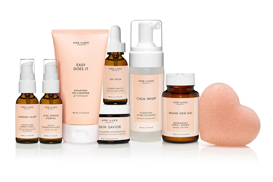
One Love Organics takes great care in designing its skincare packaging to reflect its commitment to natural and organic products. The packaging exudes a sense of simplicity, elegance, and sustainability, mirroring the brand’s ethos.
One Love Organics’ skincare packaging features clean lines and a minimalist aesthetic, allowing the products to be the focal point. The use of soft, earthy tones and natural textures creates a calming and organic feel, connecting the packaging to the brand’s emphasis on clean and nourishing ingredients.
The materials chosen for the packaging align with One Love Organics’ commitment to sustainability. Recyclable and eco-friendly materials are utilized whenever possible, ensuring a reduced environmental impact. The brand strives to minimize waste and promote conscious consumption through its thoughtfully designed packaging.
10. The Woods Eu de Parfum
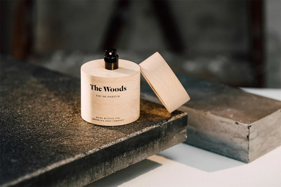
The Woods Eu de Parfum embraces an enchanting and sophisticated packaging design that perfectly complements its captivating fragrance. Every aspect of the packaging is meticulously crafted to evoke a sense of nature’s allure and timeless elegance.
The packaging of The Woods Eu de Parfum exudes a sense of mystique and enchantment, drawing inspiration from the ethereal beauty of a dense forest. The outer box features intricate illustrations of lush foliage, intricate vines, and delicate flora, creating a visual representation of the fragrance’s essence.
The materials chosen for the packaging reflect the brand’s commitment to luxury and quality. The outer box is often crafted from sturdy cardboard, adorned with a smooth, velvety finish, adding a touch of sophistication and tactile appeal.
11. The Woods Eu de Parfum
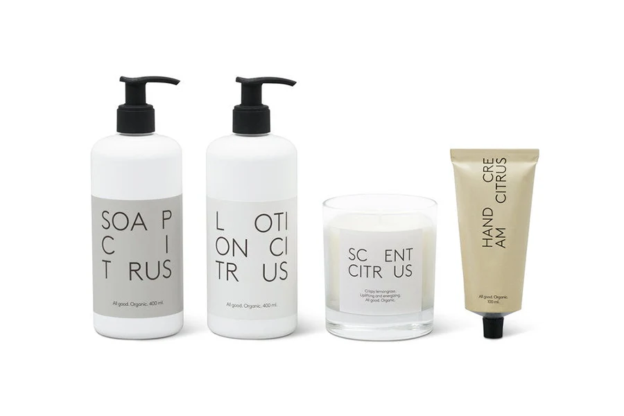
BVD took charge of designing the minimalist packaging for the renowned Swedish brand, Granit. The design embraces a neutral aesthetic, ensuring that the range of soaps, lotions, and candles seamlessly blend into any home decor.
Granit, a Swedish brand known for its interior decor, recently introduced a new line of organically produced soaps, lotions, and scented candles. These products prioritize the well-being of both people and the environment, and the packaging design reflects this commitment.
The packaging design solution for Granit embodies the brand’s distinctive characteristics, particularly its limited color palette. Spanning from natural tones to a grayscale, and extending to black and white, this carefully curated palette harmonizes with the brand’s values. The minimalistic packaging not only communicates a sense of quality but also aligns seamlessly with Granit’s dedication to Scandinavian simplicity and elegance.
Granit’s packaging design pays homage to its heritage, celebrating the essence of Scandinavian aesthetics. By embracing minimalism and understated elegance, Granit’s packaging design captures the essence of the brand while upholding its commitment to sustainability and environmentally conscious practices.
12. Tulura
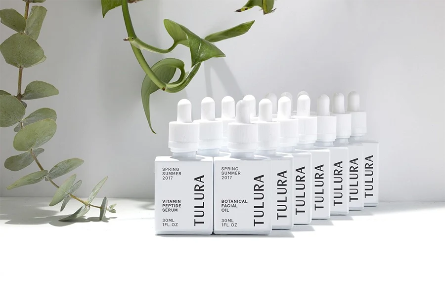
Tulura skincare prides itself on its thoughtfully designed packaging, which mirrors the brand’s commitment to simplicity, purity, and botanical efficacy. The packaging reflects the essence of Tulura’s skincare products, creating an immersive and delightful experience.
Tulura’s skincare packaging embraces a clean and minimalist aesthetic, allowing the products to take center stage. The use of soft, earthy tones, combined with crisp typography, creates a sense of tranquility and authenticity, echoing the brand’s focus on natural ingredients and holistic skincare.
The packaging materials chosen by Tulura are of the highest quality, reflecting the brand’s dedication to excellence. Glass bottles and jars are often used, not only to protect the integrity of the products but also to convey a sense of luxury and elegance.
13. Peet Rivko
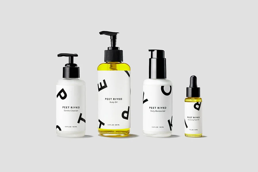
In the realm of skincare for sensitive skin, simplicity is key. Individuals with delicate skin require products that are free from excessive chemicals and irritating ingredients. This is precisely what the plant-based Peet Rivko product line offers. Designed by Gunter Piekarski, the packaging beautifully embodies the ethos of gentle, minimalistic formulations found in each item.
The packaging design for Peet Rivko is a testament to its simplicity and efficacy. A sleek, modern aesthetic is achieved through the use of black and white packaging, complemented by a bold, sans-serif font. This clean and contemporary presentation appeals to those seeking an alternative to the conventional offerings in the market.
By employing a minimalist approach, Peet Rivko highlights the purity and gentleness of its products. The straightforward packaging design reflects the brand’s commitment to providing individuals with sensitive skin a skincare solution that is both effective and devoid of unnecessary ingredients.
14. Salt+Stone
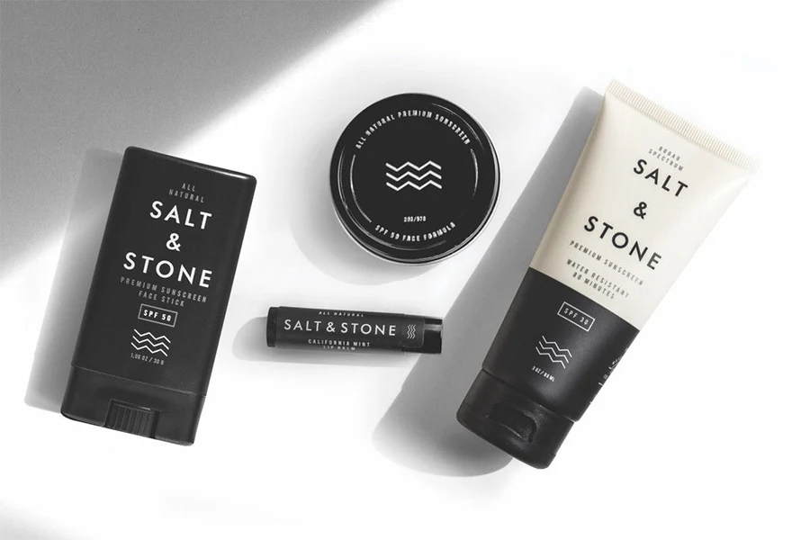
Salt+Stone skincare takes pride in its thoughtfully crafted packaging, which reflects the brand’s commitment to natural, high-quality ingredients and sustainable practices. The packaging design embodies a harmonious blend of simplicity, elegance, and functionality, aligning perfectly with the brand’s ethos.
Salt+Stone’s skincare packaging embraces a clean and minimalist aesthetic, creating a visual representation of the brand’s dedication to simplicity and purity. The use of earthy tones, combined with clean typography and subtle design elements, exudes a sense of natural beauty and authenticity.
The materials chosen for Salt+Stone’s packaging reflect the brand’s commitment to sustainability. Recyclable and eco-friendly materials are utilized whenever possible, ensuring a reduced environmental impact. This eco-conscious approach aligns with Salt+Stone’s mission to provide skincare solutions that are not only effective but also mindful of the planet.
15. Alex Carro
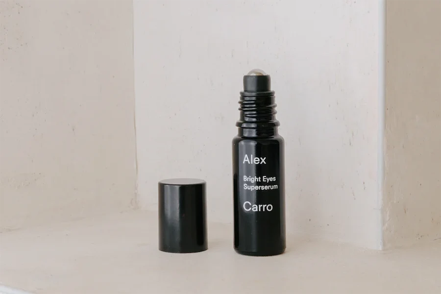
Alex Carro skincare takes great care in designing its packaging to reflect the brand’s commitment to simplicity, efficacy, and natural beauty. The packaging embodies a sense of elegance and minimalism, perfectly mirroring the brand’s ethos.
Alex Carro’s skincare packaging embraces a clean and contemporary aesthetic, exuding a sense of understated luxury. The use of soft, neutral tones and sleek typography creates a visually appealing and cohesive look that aligns with the brand’s focus on simplicity and sophistication.
The materials chosen for Alex Carro’s packaging are of the highest quality, reflecting the brand’s dedication to excellence. Glass bottles and jars are often utilized, not only to protect the integrity of the products but also to convey a sense of premium craftsmanship and sustainability.
16. C’est Ça Herbal Soap
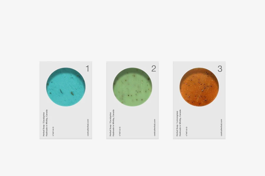
C’est Ça merges a bold, angular rectangle with a flawless circle, resulting in a vibrant and contemporary packaging design. The soaps’ colors effortlessly stand out against the white and black packaging, with each soap distinguished by a unique number. The use of minimal and small-sized text directs the focus towards the soap, enticing consumers to engage their senses and select the perfect scent that resonates with them.
17. O’Care
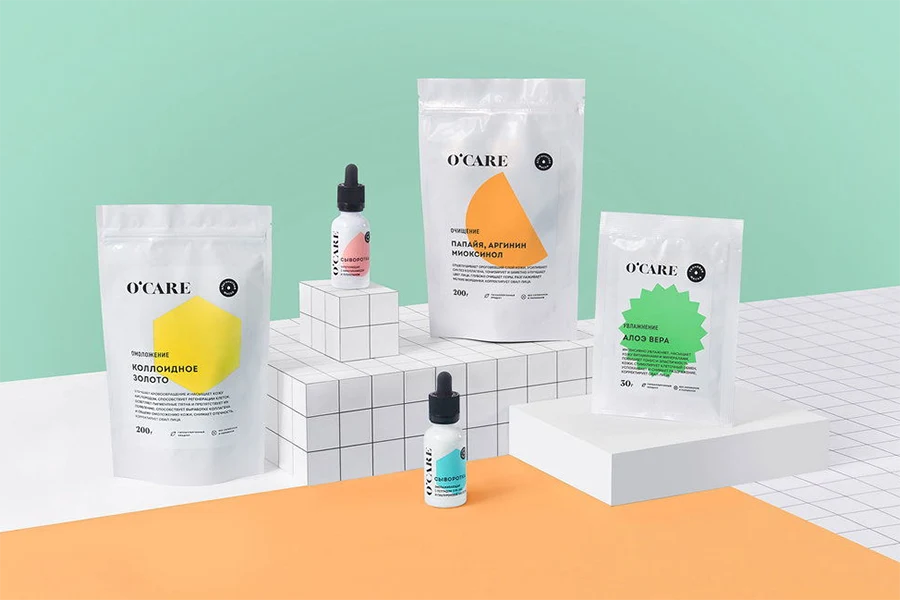
O’Care, a newly established cosmetic brand specializing in alginate facial masks, underwent a comprehensive transformation that included naming, logo, and package design. With a primary focus on young women, O’Care offers a diverse range of 20 vibrant masks formulated with various ingredients.
To capture the essence of the brand, a classic serif font was chosen for the logo, harmoniously combined with a clean and contemporary visual identity. Simplified geometric icons were employed to symbolize the ingredients used in the masks, adding a touch of modernity to the overall design.
The goal was to create a design that is easily recognizable and comprehensible to everyday consumers in a retail setting. O’Care’s packaging design achieves this objective, allowing customers to swiftly identify and understand the unique attributes of each mask variant.
With a blend of classic and modern elements, O’Care’s branding and packaging design strike a perfect balance, catering to the target audience’s preferences while standing out on retail shelves. The intention was to create an aesthetic that seamlessly resonates with consumers, enticing them to explore the range and find the perfect mask for their skincare needs.
18. Ahal
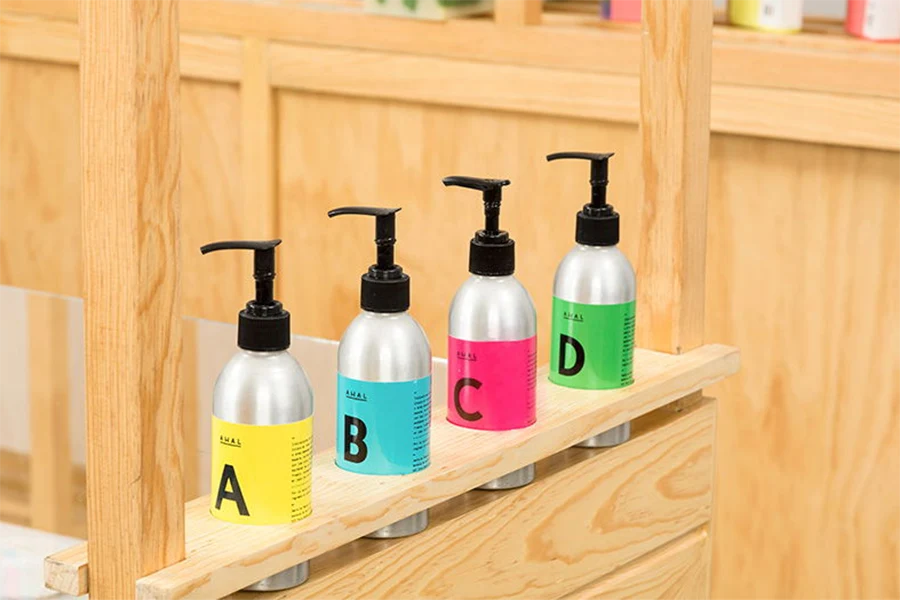
The design of Ahal embraces a minimalistic approach, utilizing number coding to distinguish its products instead of relying on specific advertised scents. The packaging exudes a laboratory-like aesthetic, yet it maintains a balance that prevents it from appearing overly clinical in an everyday bathroom setting.
The color palette chosen for Ahal is vibrant and optimistic, striking a delightful balance between saturated hues and soft pastels. These colors possess a personality that captures attention without being excessively neon or overwhelming. They create an appeal that resonates perfectly with adults seeking bath products that are not only inspired but also crafted with premium ingredients.
19. ASARAI
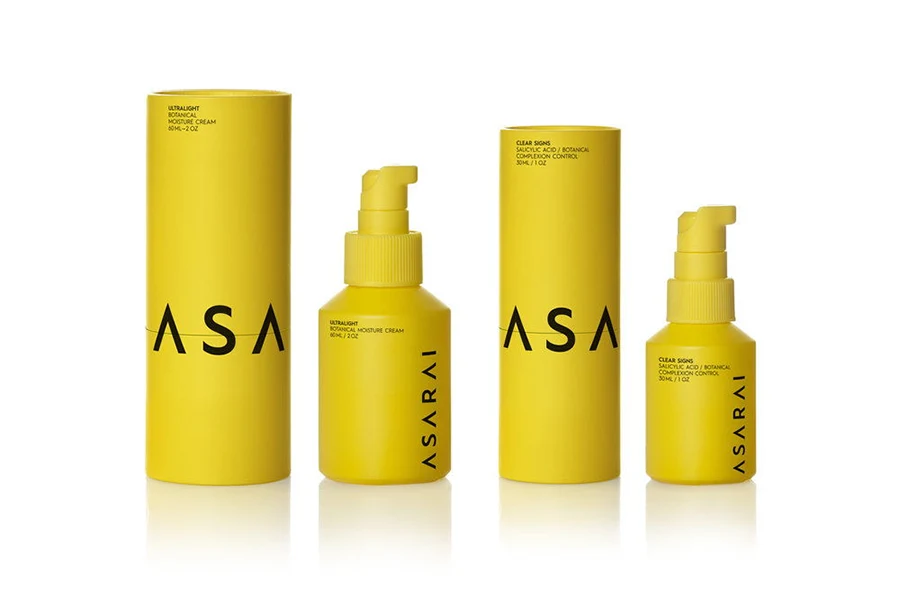
The design concept revolves around two fundamental elements that synergistically contribute to a distinct and powerful brand identity for ASARAI: a vibrant and unconventional yellow color, and a striking typeface used dynamically throughout the packaging.
ASARAI, the brand’s name, commands attention with its assertive linear placement on the all-yellow surface of each product container. However, an intriguing twist awaits on the outer tubular box, where the brand name takes on a playful and unconventional interpretation. With each closure of the tube’s upper part onto the lower one, the arrangement of the letters transforms, creating a unique visual experience. The brand name undergoes fragmentation, rearrangement, and conceptual completion through chance encounters. This fluid approach to design mirrors a dynamic and confident perception of the brand name and its underlying values.
The bright yellow hue serves as a distinctive signature, ensuring immediate recognition and capturing the essence of ASARAI’s brand identity. The bold typeface further enhances the visual impact, contributing to the brand’s overall personality and allure. Through the harmonious fusion of color, typography, and innovative packaging, ASARAI embraces a dynamic design language that embodies confidence and embodies the brand’s core values.
20. Dr. Jart+
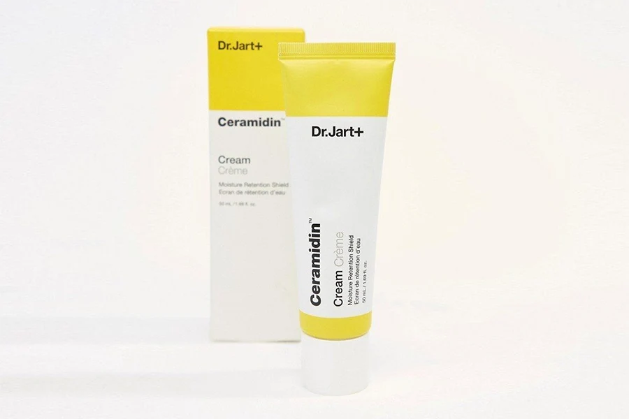
Dr.Jart+ cream tube skincare packaging is a testament to both functionality and visual appeal. Designed with meticulous attention to detail, the packaging embodies the brand’s commitment to innovation and quality.
The cream tube packaging features a sleek and modern design, reflecting the brand’s contemporary approach to skincare. The tube is made of durable materials, ensuring the product’s longevity and ease of use. Its compact size makes it convenient for travel and on-the-go application, allowing users to enjoy the benefits of Dr.Jart+ creams wherever they may be.
The brand’s logo is prominently displayed on the tube, exuding a sense of trust and credibility. The typography is clean and legible, making it easy for customers to identify the product and its specific formulation.
Dr.Jart+ cream tube packaging is designed to protect the product from external elements, such as air and light, ensuring the preservation of its efficacy. The secure cap ensures that the cream remains sealed and intact until the moment it is used.
The overall aesthetic of the packaging is minimalistic yet sophisticated. The color palette is often clean and neutral, allowing the focus to be on the product itself. The simplicity of the design enhances the brand’s reputation as a trusted skincare provider, while also appealing to a wide range of consumers.
21. The Gentle Label
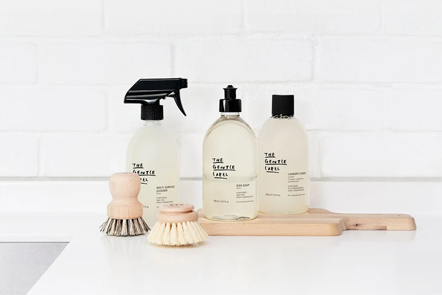
The Gentle Label skincare packaging encapsulates a sense of purity and simplicity, mirroring the brand’s commitment to gentle and natural skincare solutions. Designed with utmost care, the packaging reflects the brand’s values and creates a delightful visual experience.
The packaging features a clean and minimalist design, emphasizing the use of soft, muted colors and subtle textures. These elements create a soothing and calming effect, inviting users to embrace a gentle skincare ritual. The brand’s logo is elegantly displayed, representing its authenticity and trustworthiness.
The materials chosen for The Gentle Label packaging are environmentally friendly and sustainable, aligning with the brand’s dedication to eco-conscious practices. Recyclable materials and responsible sourcing ensure that the packaging reflects the brand’s commitment to both skincare and the environment.
With a focus on user experience, the packaging is designed to be functional and user-friendly. It provides easy access to the products while maintaining their integrity and freshness. Clear labeling and informative product descriptions offer transparency and aid consumers in selecting the right skincare solutions for their needs.
The Gentle Label skincare packaging embodies a harmonious blend of aesthetics and functionality. It communicates the brand’s core values of gentleness, purity, and sustainability, inviting customers into a world of mindful self-care. By emphasizing simplicity and natural beauty, The Gentle Label packaging invites users to embrace a holistic skincare experience that nurtures both their skin and well-being.
22. Nuda Esta
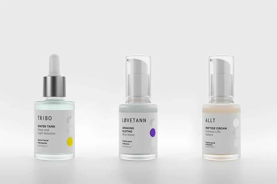
The skincare packaging design of Nuda Esta goes beyond mere functionality and aesthetic appeal. It serves as a tangible connection between the user and the packaging, engaging them through visual and tactile stimulation. The unique physical characteristics, including the alluring glaze, create a sensory experience that captivates and delights.
This project provided us with valuable insights into the interplay between emptiness and color as powerful tools for communication and identification. The packaging acts as more than just a vessel; it becomes the very message itself. Through thoughtful design choices, Nuda Esta leverages the packaging as a medium to convey its brand values and identity.
Every aspect of the packaging design is meticulously crafted to forge a deep connection with the user. The combination of colors, textures, and finishes elevates the visual and tactile experience, leaving a lasting impression. The packaging becomes an integral part of the product’s narrative, enhancing the overall brand storytelling.
Nuda Esta’s skincare packaging design exemplifies the seamless fusion of functionality and artistic expression. It serves as a bridge between the brand and its customers, forging a tangible and memorable connection. By leveraging the power of design elements, Nuda Esta has created a packaging experience that not only captivates but also communicates the essence of its brand.
23. Youth to the People
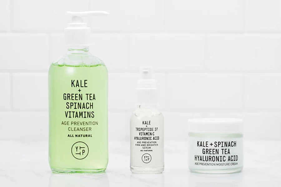
The packaging design of the YTTP skincare line draws inspiration from juice packaging, showcasing the natural, wholesome ingredients used in the products. It embraces a revolutionary approach to skincare, highlighting the ingredients as the stars of the design. Both the boxes and glass containers are crafted with sustainability in mind, as they are 100% recyclable.
The YTTP packaging design features brown boxes adorned with fresh white text and a touch of vibrant color, reflecting the brand’s modernity and innovative approach. The transparent bottles and containers allow the light hues of the products to shine through, inviting customers to appreciate the natural essence within. The choice of a modern and simple font adds subtlety to the bathroom display while enabling effortless mix-and-match possibilities throughout the line.
Promotional materials further emphasize the natural ingredients by showcasing visuals of kale, spinach, and alfalfa. This imagery reinforces the brand’s commitment to utilizing botanical goodness in their formulations. The overall aesthetic is kept bright and organized, conveying the message that YTTP encourages thoughtful skincare routines as part of daily life.
YTTP’s packaging design strikes a harmonious balance between functionality and visual appeal. It effectively communicates the brand’s belief in the significance of skincare, urging consumers to mindfully consider the products they use on a regular basis. By marrying the concept of juice packaging with skincare, YTTP establishes itself as an innovative brand that prioritizes the nourishing power of natural ingredients.
24. St. Weiss
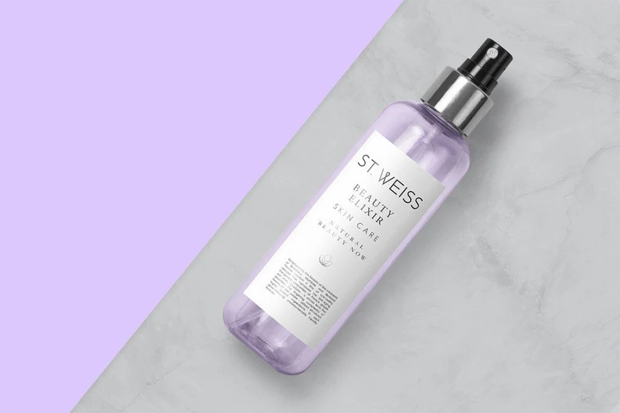
St. Weiss is a skincare brand based in Guadalajara, Jalisco, Mexico. With a meticulous focus on detail, they offer professionally formulated products that promote balance and well-being for women’s skin. Their product range is a response to the growing consumer demand for effective natural skincare solutions. St. Weiss aims to meet the needs of customers seeking anti-aging products or desiring to maintain youthful and radiant skin, effectively “locking the skin’s time.”
The graphic solution employed by St. Weiss encompasses a clean and refined identity, complemented by a sophisticated yet captivating color palette. To enhance their communication efforts, detailed illustrations with a botanical aesthetic are utilized, fostering an image of trustworthiness and exceptional quality. These visuals further reinforce the thoughtfulness and dedication behind St. Weiss’s product range.
Through their carefully crafted brand identity and commitment to delivering results, St. Weiss has positioned itself as a reliable and reputable skincare brand. Their range of products caters to the discerning needs of individuals who seek natural skincare solutions that are both effective and trustworthy. By embracing a clean design approach and incorporating botanical-inspired illustrations, St. Weiss communicates a sense of confidence and excellence, reinforcing the brand’s dedication to providing high-quality skincare products.
Conclusion
In conclusion, the world of skincare packaging has witnessed a remarkable rise in minimalist designs that effortlessly capture attention and convey a sense of elegance and simplicity. The 24 stunning examples showcased in this blog post serve as a testament to the power of minimalism in the beauty industry.
Whether it’s the clean lines, subtle color palettes, or thoughtful typography, these minimalist skincare packaging designs have successfully created a visual language that resonates with consumers seeking a modern and sophisticated aesthetic. The emphasis on simplicity allows the products to shine, while the carefully chosen elements communicate the brand’s values and story.
If you’re inspired by these minimalist packaging designs and looking to elevate your own skincare brand, UKPACK is here to assist you. As a professional cosmetic packaging supplier, UKPACK offers a range of minimalist skincare packaging options that can complement your brand’s vision. Their expertise and dedication to delivering high-quality packaging solutions make them an ideal partner for bringing your minimalist skincare packaging ideas to life.
Remember, in the world of skincare, less is often more. With minimalist packaging that exudes sophistication and captures the essence of your brand, you can create a lasting impression on your customers and stand out in a crowded market.
Reach out to UKPACK today and discover how our minimalist skincare packaging solutions can elevate your brand and captivate your audience. Your journey towards minimalist beauty starts here.
Luxury Skincare Packaging: A Comprehensive Guide
Welcome to the captivating world of luxury skincare packaging! Whether you’re a brand owner or a beauty enthusiast, understanding the nuances of packaging can elevate your skincare game. In [...]
Creative Sunscreen Packaging Ideas: Boost Your Brand
Sunscreen is essential for skin protection, but let’s face it—its packaging can make or break a customer's first impression. In a saturated market, having creative and effective sunscreen packaging [...]
The 25 Best Hair Care Brands of 2024
Welcome to the ultimate guide to the best hair care brands of 2024! Whether you're on the hunt for products that will give you luscious locks or looking to [...]

